Marie Neurath
Picturing Science
Marie Neurath (1898–1986) was a ground-breaking graphic designer. She analysed complex information and transformed it into concise explanations that combined words and pictures.
Her work as a transformer started in Vienna in the 1920s when she began collaborating with Otto Neurath. The method of visual explanation they and others developed became known as ‘Isotype’ (International System of Typographic Picture Education). Otto and Marie Neurath established the Isotype Institute in 1942 after they escaped to England from Nazi-occupied Europe.
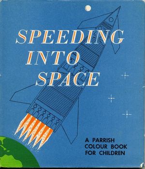
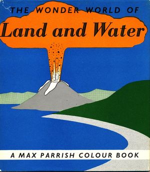
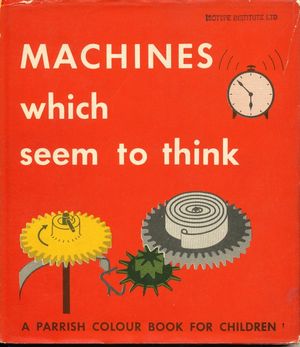
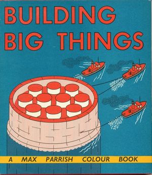
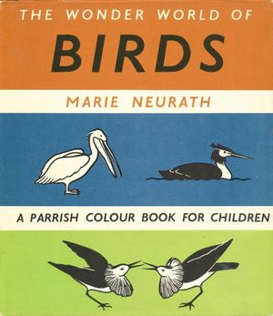
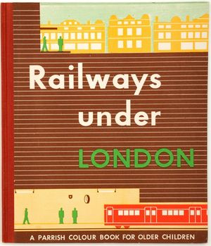
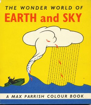
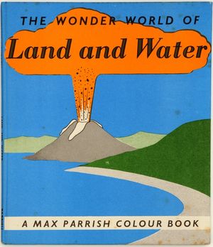
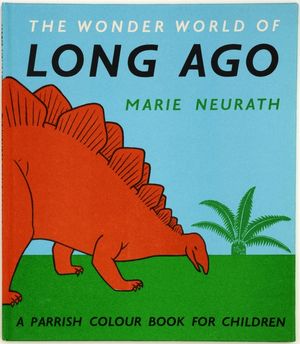
In Oxford, the Neuraths developed ideas for children’s books about science, technology and other non-fiction topics. After Otto Neurath’s death in 1945, Marie Neurath continued their work in London until the late 1960s. She directed a team of writers and illustrators who produced more than eighty children’s books.
Originally an exhibition at the House of Illustration, this exhibition explores Marie Neurath’s pioneering methods for explaining science to children.
Early Ideas
‘Just boxes’
Otto and Marie Neurath began working on books for children in the 1940s. Many of their ideas were drawn from Otto Neurath’s childhood memories, and from his views on visual education. He believed that children learned best from pictures that encouraged them to make comparisons and work things out for themselves.
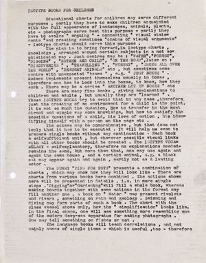
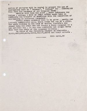
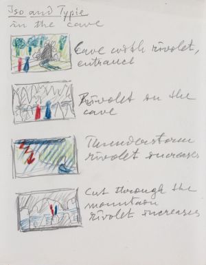
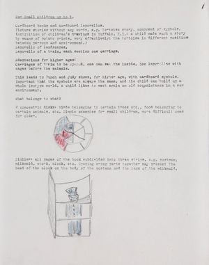
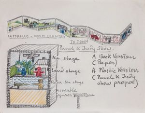
Initial ideas
Typescript synopsis (1944) written by Otto Neurath, and accompanying drawings, presenting some of his ideas for engaging with young people.
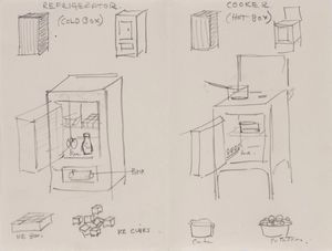
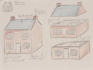
Drawings
Otto Neurath wrote “. . . modern implements present themselves usually in boxes, therefore one has to look into the box to see how they work.”
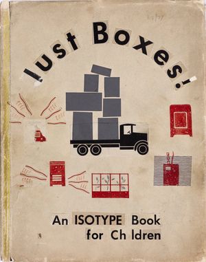
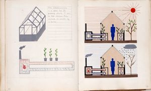
‘Just boxes’ Preparatory sketch, cover drawing, and spread, 1944
‘Just boxes’ is based on the idea that approaching things from an unusual angle would interest young readers.
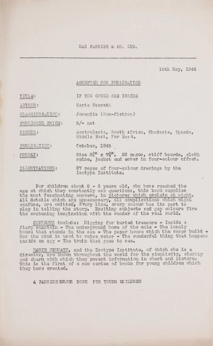
Letter of acceptance
The letter writes ... ”Marie Neurath, and the Isotype Institute, of which she is a director, are known throughout the world for the simplicity, clarity and charm with which they present information in chart and picture.”
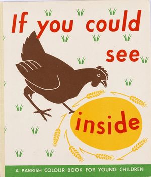
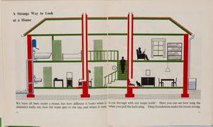
If you could see inside, London: Max Parrish, 1948
This title was developed from Otto Neurath’s ideas for ‘Just boxes’. The whole of the book makes use of cross-section illustrations to show and explain the inner structure and workings of common things.
Otto Neurath explained his theories about visual education in correspondence sent to the book packaging company, Adprint. To show his ideas he also sent drawings and book mock-ups, such as ‘Just boxes’. ‘Just boxes’ was later developed into the published book, If you could see inside (1948).
Explaining the Natural World
‘The Wonder World of Nature’
This series, for children aged 7–10, was described by the publisher as providing ‘simple explanations of the strange things that happen in nature’. Seventeen titles were published between 1952 and 1962. Children were introduced to deserts, jungles and life under the sea, as well as familiar and less familiar animals, birds and insects.
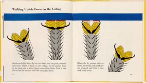
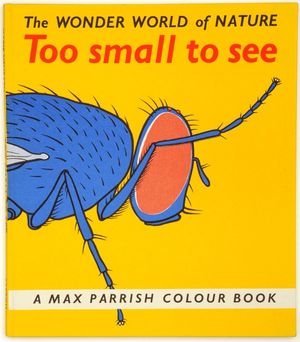
Too small to see, London: Max Parrish, 1956
This book uses magnification to draw attention to things that you would not usually see, such as creatures inside a drop of water or the structure of mould on a piece of cheese. This intriguing view of a fly shows the tiny hairs on its legs that help it to walk on the ceiling.
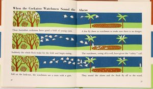
The wonder world of birds, London: Max Parrish, 1953
Many of the books used several picturing techniques. Marie Neurath liked the idea of repeating a base image so that differences and changes could be easily seen.
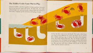
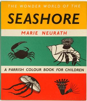
The wonder world of the seashore, London: Max Parrish, 1954
Few people know much about the underground life of the fiddler crab. Here, Marie Neurath describes in pictures what happens above and below the surface on the beach. The text draws attention to ‘bright red’ males and the ‘dark red’ females.
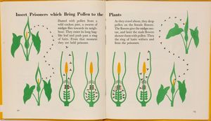
The wonder world of strange plants, London: Max Parrish, 1956
This book introduces young people to plants they would be unlikely to have seen, such as bladderwort, sundew and a water lily so big that a child could sit on it.
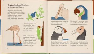
The wonder world of birds, London: Max Parrish, 1953
Marie Neurath understood what would engage young people. These illustrations encourage readers to make comparisons between birds’ beaks that are adapted to different purposes. The captions do not name the bird, allowing the reader to do so themselves.
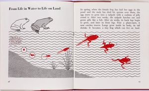
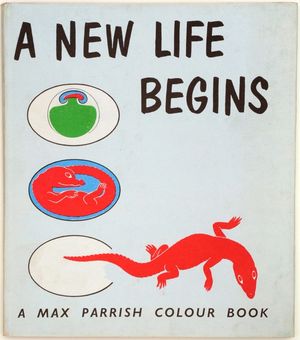
A new life begins, London: Max Parrish, 1961
This book illustrated the development and birth of babies, including a squid, a rabbit, a crocodile and a human. The red images show the journey of development and animate the page.
Full colour is used to add meaning, to add to the clarity of the visual statement, rather than as decoration, and the clean refreshing brilliance of the drawings never fails to appeal to children and to capture their enthusiasm. Parrish publicity leaflet, 1961
Interpreting Technology and Physics
‘Wonders of the Modern World’
This series comprised simple ‘how and why’ books for younger readers and ‘books for older children on modern scientific and engineering topics’. Sixteen titles published between 1948 and 1961 covered a diverse range of topics including atomic energy, aeronautics, telegraphy and engineering.
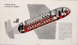
Rockets and jets, London: Max Parrish, 1951
In this book rockets are shown taking off and flying through the air. The red floor in this picture of a jet makes the seating plan clear.
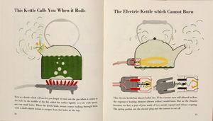
Machines which seem to think, London: Max Parrish, 1954
Many of the books featured domestic objects that readers would have in their homes. Marie Neurath and her team used these to engage children with scientific principles. Here, cross-section is used to show the inner workings of two kinds of kettle.
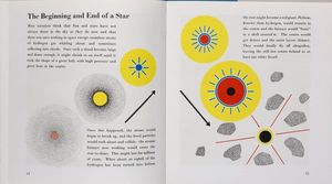
Wonders of the universe, London: Max Parrish, 1961
Many of the books in ‘Wonders of the Modern World’ series were about space and the earth’s atmosphere. Using diagrammatic techniques, Marie Neurath illustrated the inside of the sun, a galaxy and the life cycle of a star.
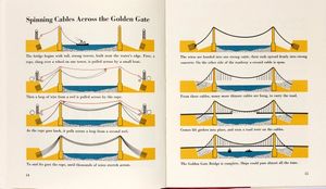
Building big things, London: Max Parrish, 1958
This book about engineering included illustrations of ship building and the making of complex road junctions as well as the workings of the Panama Canal, Tower Bridge and the Golden Gate.
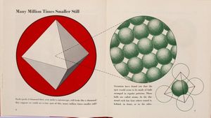
Inside the atom, London: Max Parrish, 1956
The explanations in Inside the atom show the internal structure of an atom as well as in the context of electric currents, the heat of the sun and in x-rays.
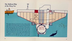
Exploring under the sea, London: Max Parrish, 1958
Life beneath the sea intrigued Otto and Marie Neurath. The pictures in this book explain how divers breathe and swim, what happens inside a submarine and how engineering makes deep sea exploration possible.
I had to ask myself: what are the essential things we want to show, how can we use comparison, direct the attention, through the arrangement and use of colour, to bring out the most important things at first glance, and additional features on closer scrutiny. Details had to be meaningful, everything in the picture had to be useful for comparison. Marie Neurath, 1971
Making the Books
The wonder world of land and water, 1957
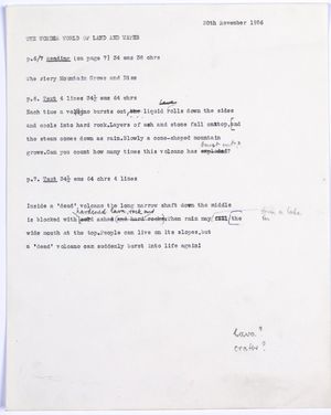
Isotype books for children were made by a team of researchers, writers and illustrators under the direction of Marie Neurath. She gathered feedback from experts at all stages in the process to ensure that text and illustrations were scientifically accurate.
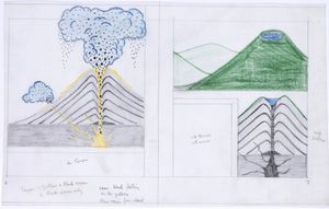
Designing the spreads
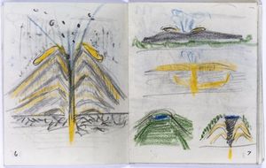
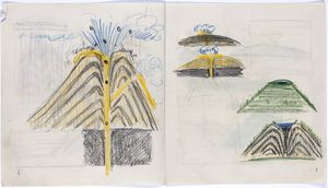
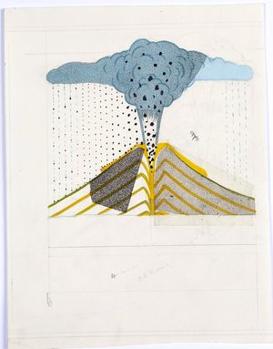
Marie Neurath and her team used their research to produce illustrations and text. Each double-page spread went through several iterations to work out where words and images would be placed and how colour might be used. Small ‘dummy books’ were made to plan the order of the pages.
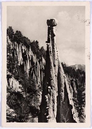
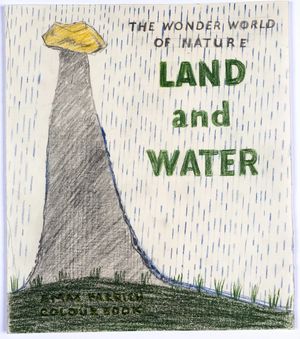
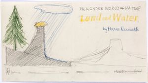
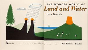
Title page and cover sketches
Different designs were tried out for the title page and cover, before they were agreed by the publisher.
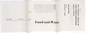
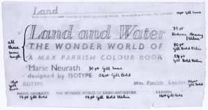
Typesetting
The type was set and printed on long sheets of paper (galleys). The galleys were then cut up and pasted on to boards that were sent to the printer.
We got the information from many books and periodicals, one of our institute went to the library and read the latest material. Then we talked and she explained everything to me, and I sat down and made new sketches, and talked them over with other people, and showed them to a man who knows everything about the subject, and then the final drawings were made by the designers in our institute. You see, this is like a little factory making picture books, we make one after the other, it is great fun. Marie Neurath
Communicating Processes
‘Visual Science’
‘Visual Science’ (1950–1952) was a series of six books intended for use in schools. Marie Neurath and her co-author, Joseph Lauwerys, aimed to introduce science in a way that was creative and stimulating for pupils and teachers. Many of the spreads include questions that could only be answered by looking carefully at the pictures. They were accompanied by Notes for the teacher, which suggested activities that related scientific processes to every-day experiences such as baking bread or lighting a match.
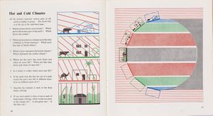
Book 1, Visual Science, London: Max Parrish, 1950
A graphic explanation of the climate in different parts of the world at the same time in spring.
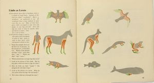
Book 2, Visual Science, London: Max Parrish, 1950
Colour is used to relate hands and feet in the human body (familiar to children) to equivalent parts of animal bodies.
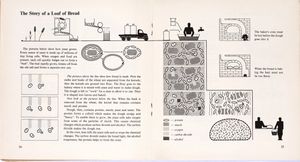
Science in the home, Book 3, Visual Science, London: Max Parrish 1951
This spread explains the making of a loaf of bread beginning with the ear of wheat (top left) to the shopping basket bottom right. The teachers’ notes suggest how teachers might engage children with the topic and provides suggestions for related activities.
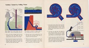
Machines which work for man, Book 6, Visual Science, London: Max Parrish, 1952
A set of explanations about turbines.
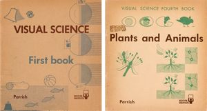
Two covers from the series
Book 1, Visual Science, London: Max Parrish, 1950
Plants and animals, Boom 4, London: Max Parrish, 1951

Visual Science Promotional leaflet
London: Max Parrish, c. 1950
As you turn the pages of this book, you will notice that it uses more pictures and fewer words than most schoolbooks you have seen. These pictures, called Isotype charts, are not meant to show you exactly how things look but to give you information about them, like a map or an engineer’s blue-print. Because they have an unusual job to do they are made in an unusual way. Everything which would not help you understand the meaning, or which would confuse you, is left out. Colours are used only to help make the meaning clearer, never simply as decorations. This means that every line and every colour in these pictures has something to tell you. Preface to ‘Visual Science’ Teachers’ notes


